mirror of
https://github.com/GeorgeSG/lovelace-time-picker-card.git
synced 2026-09-06 02:18:44 +00:00

8.1 KiB
8.1 KiB
Time Picker Card







Overview
This is a Time Picker Card for Home Assistant's Lovelace UI.
Requires an Input Datetime that has time (has_time: true).
Installation
Install using HACS or follow this guide
resources:
  - url: /local/time-picker-card.js
    type: module
Usage
Visual Editor
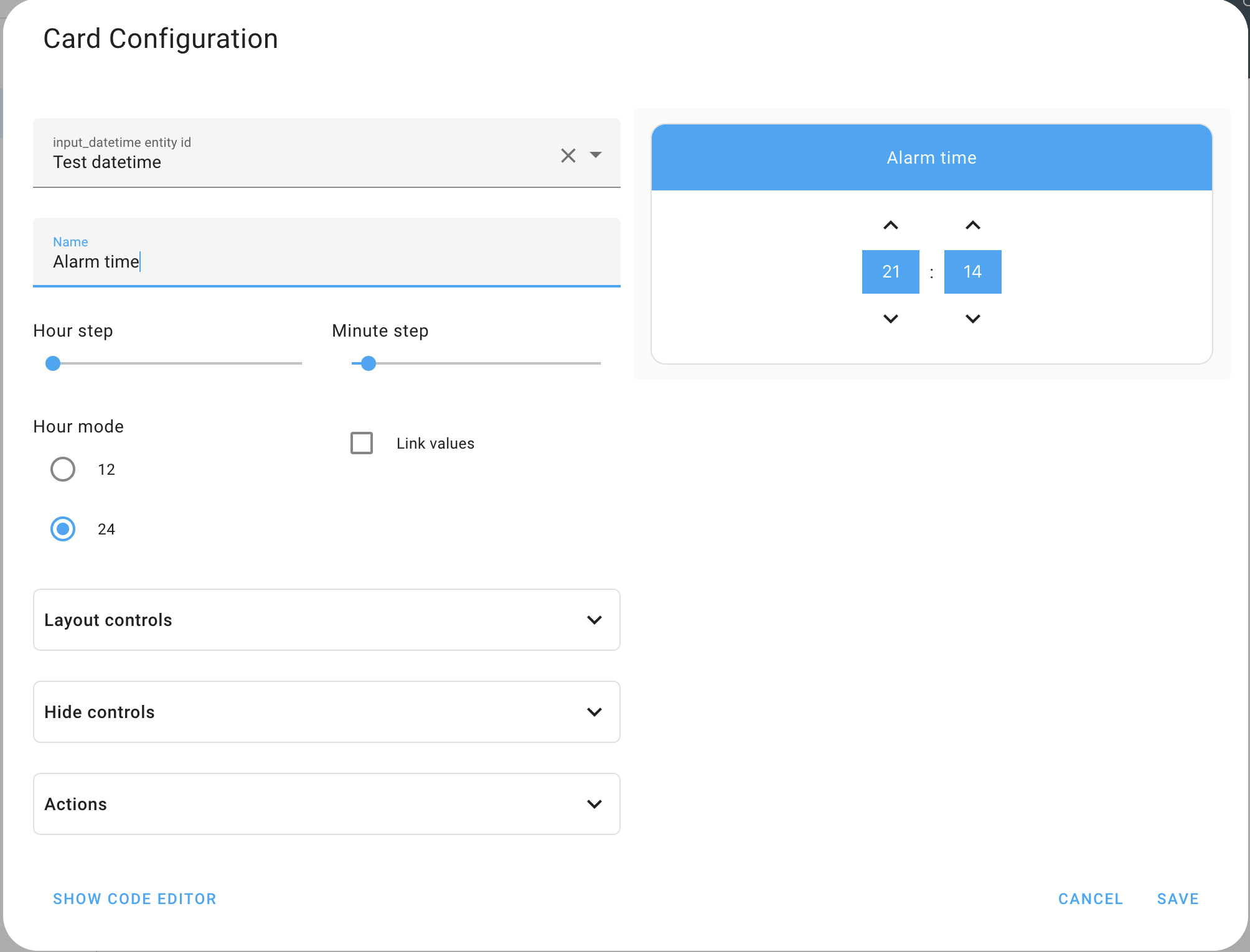
Time Picker Card supports Lovelace's Visual Editor. Click the + button to add a card and search for time picker.
YAML
type: 'custom:time-picker-card'
entity: input_datetime.alarm_time
name: 'Choose a time'
hour_mode: 24
hour_step: 1
minute_step: 5
hide:
  name: false
Examples
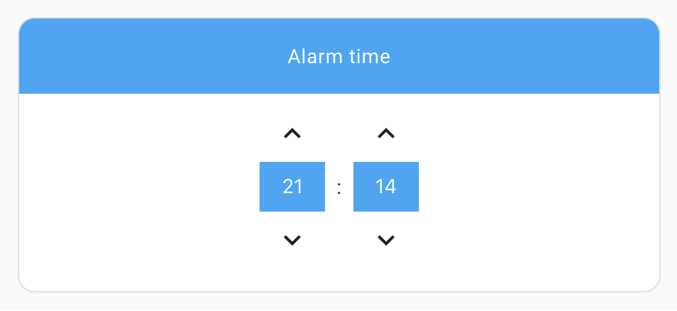
Default config - card name shown, 24 hour mode
type: 'custom:time-picker-card'
entity: input_datetime.alarm_time
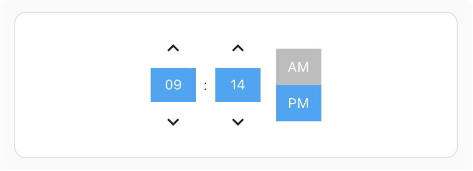
Custom config - hidden card name, 12 hour mode
type: 'custom:time-picker-card'
entity: input_datetime.alarm_time
hour_mode: 12
hide:
  name: true
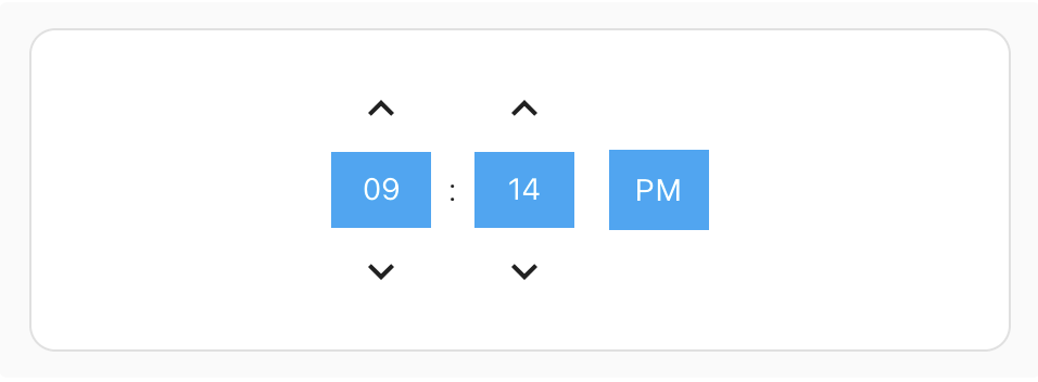
Custom config - hidden card name, 12 hour mode with a "single" hour mode picker
type: 'custom:time-picker-card'
entity: input_datetime.alarm_time
hour_mode: 12
layout:
  hour_mode: single
hide:
  name: true
Custom config - card name inside card and controls aligned right
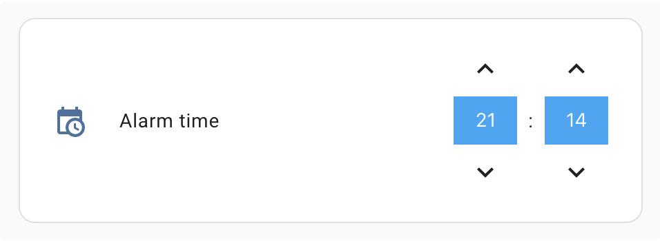
type: 'custom:time-picker-card'
entity: input_datetime.alarm_time
layout:
  name: inside
  align_controls: right
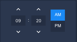
With a custom lovelace theme
Options
| Name | Type | Requirement | Description | Default |
|---|---|---|---|---|
| type | string | Required | custom:time-picker-card |
|
| entity | string | Required | Input Datetime entity with has_time: true |
|
| name | string | Optional | Card name | Entity's friendly_name |
| hour_mode | 12 or 24 |
Optional | Hour format. If 12, card will show AM/PM picker |
24 |
| hour_step | number | Optional | Hour change when clicking arrows | 1 |
| minute_step | number | Optional | Minute change when clicking arrows | 5 |
| layout | object | Optional | Card Layout configuration | none |
| hide | object | Optional | Hide object | none |
Layout Object
| Name | Value | Requirement | Description | Default |
|---|---|---|---|---|
| hour_mode | single, double |
Optional | Whether to show both AM/PM or just the current mode. In single mode, tap the value to change it. |
double |
| align_controls | left, center, right |
Optional | Horizontal alignment of the controls | center |
| name | header, inside |
Optional | Whether to show the name as a header or inside the card | header |
Hide Object
| Name | Type | Requirement | Description | Default |
|---|---|---|---|---|
| name | boolean | Optional | Hides the card name | false |
Theme Variables
Time Picker Card will automatically pick up colors from your lovelace theme, but if you want to customize some of them, you can use the following variables in your theme's config file:
| Name | Default | Description |
|---|---|---|
| time-picker-elements-background-color | var(--primary-color) |
Background color for header and inputs |
| time-picker-icon-color | var(--primary-text-color) |
Arrow color |
| time-picker-text-color | white |
Text color |
| time-picker-accent-color | var(--primary-color) |
AM / PM active color |
| time-picker-off-color | var(--disabled-text-color) |
AM / PM inactive color |
Meta
Georgi Gardev

